PJUS US Platform
Client: PJUS (Brazil)
2022
UI/UX Design [User interview] | Dashboard | Design System | HTML5 | CSS3 [Sass] | Figma [Design + Prototype]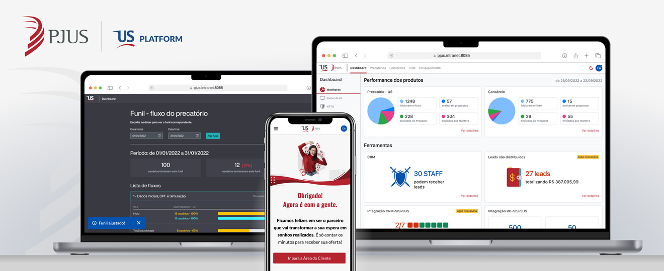
Please notice
In respect to the NDA signed with the client, some visual features shown in this page differ from the final product. This does not affect however the substance of this presentation.
Overview
In Brazil, when a person files a lawsuit against the government and has a favorable unappealable judgment, they earn the right to a specific money damage called "Precatório". Nevertheless, the government can take years or even decades to pay its debt. This is why PJUS exists: the company has about 10% of its market share and offers to buy that right from the prevailing party, paying immediately for it with variable discounts, after an analysis which involves complex relations between variables like jurisdiction, taxes, risk, age and total value. In order to function, PJUS needs both robust internal systems for its technical staff and a public, friendly website in which people can see and sell their rights.
Why they called me
PJUS needed an UX/UI Designer with experience with Design Systems and in identifying user pains and needs to act on two fronts:
- Redesign their internal analysis platform: they were relying on fragmented legacy systems built one over another along time, resulting in underperformance and redundant data. Tasks like finding information, building customer relationship and risk analysis were time-consuming and overcomplicated, resulting in repetitiveness, conflicting information and lost opportunities. An unified system with consistent design would solve these problems;
- Redesign their public website: too many steps and long forms confused users who choose PJUS. Funnel analysis data in Google Analytics demonstrated loss of interest, especially in older age brackets (60 years and more), who considered the online selling process way too complex, often delegating the task to younger relatives. The improvement of this experience, vital to the client's business, had to be addressed ASAP.
How I helped them
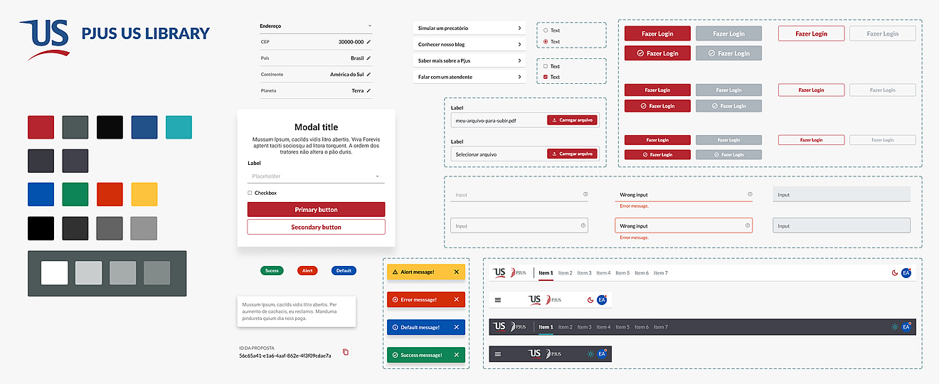
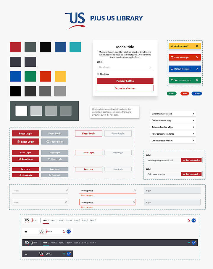
As PJUS had no specific management framework for their (small) design teams at that time, I had to create a public Kanban, visible to all the developers and business stakeholders, to control and track my priorities. The first task was to create a Design System that would be the visual foundation of everything else. Then, starting from the data I had (funnel analysis, business stakeholder input and qualitative interviews from both internal and external users), I began to draw screens.
Internal front
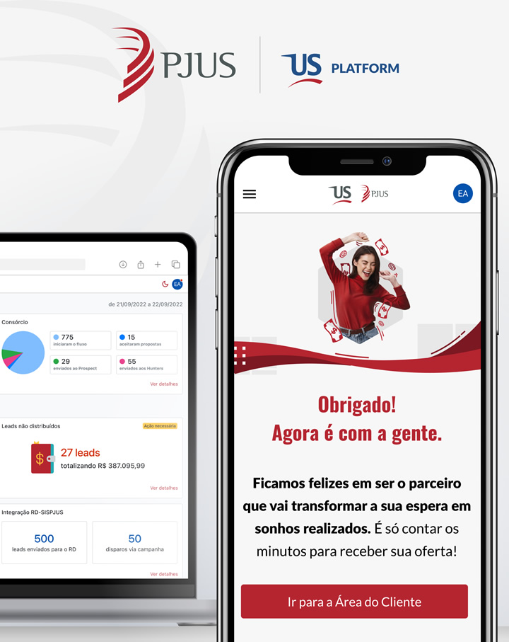
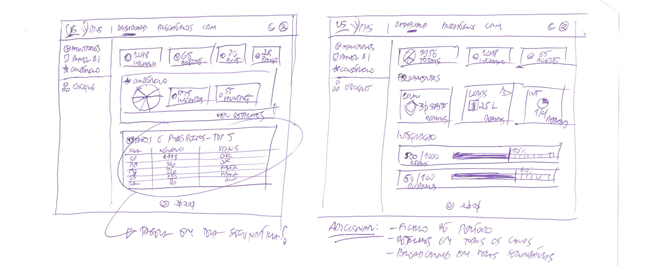
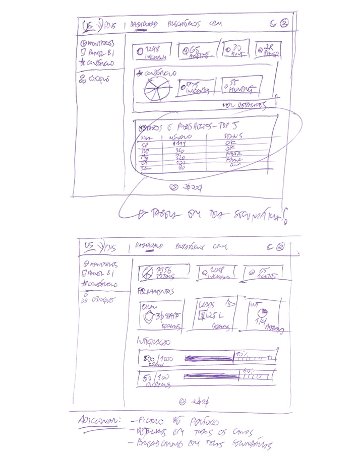
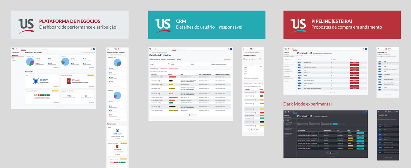
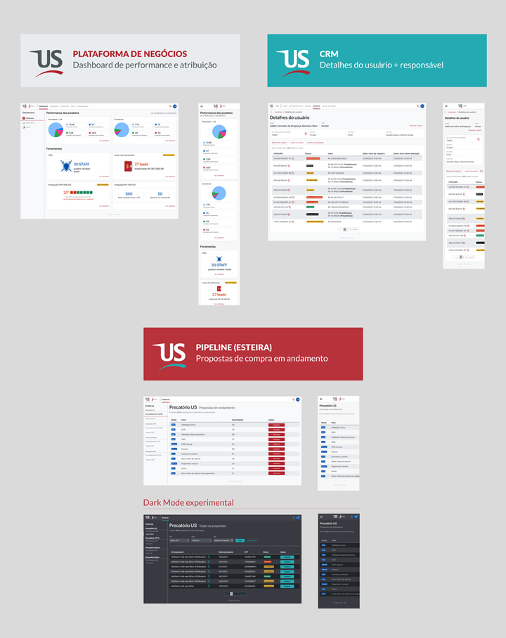
I simultaneously designed three responsive experiences for the platform using Figma: the business dashboard, where managers could watch and control leads, client access and work distribution; the CRM system, containing client's data, status, analysis and negotiated values; and the pipeline system, where specialized staff could follow all details of every sale proposal. I ran some qualitative interviews with stakeholders, developers and users to understand which information should be displayed first and how the most crucial data should be put on the initial screens. Prototypes were essential to find major pains of the technical staff, like missing information and proposal status.
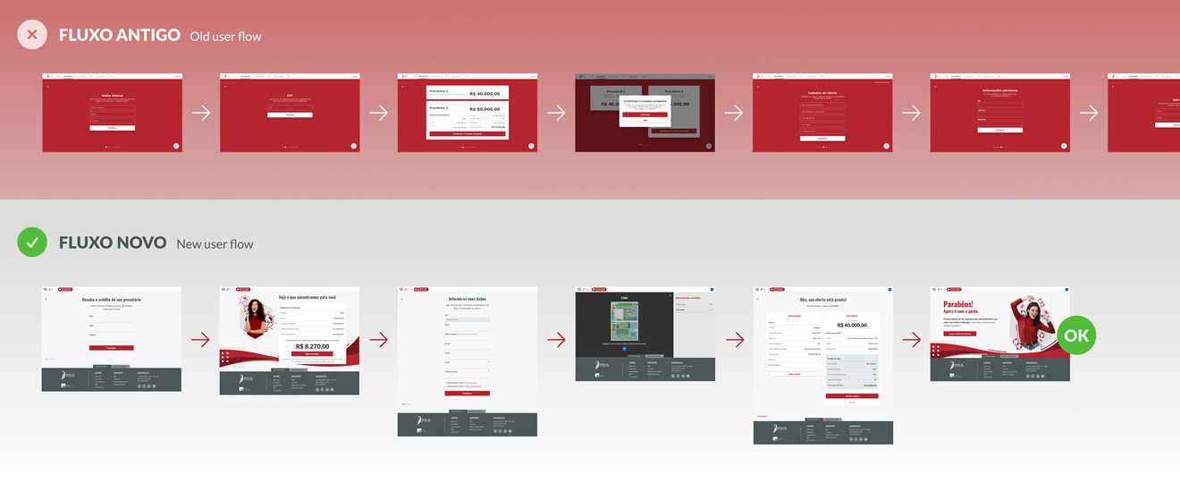
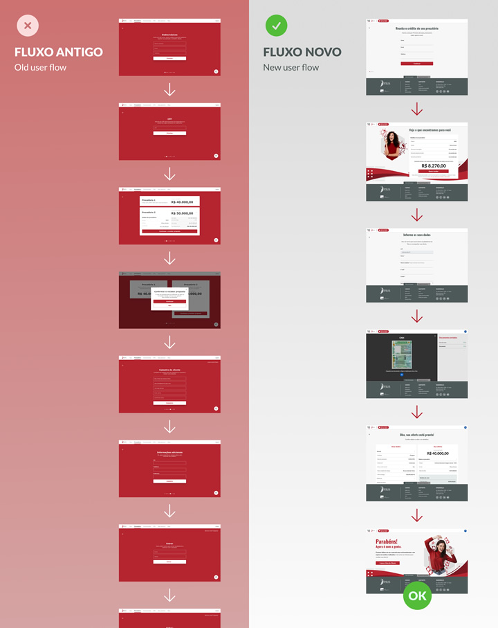
Public front
The user journey for selling rights through the public website was almost totally revamped, both visually and functionally: the red background color that annoyed users in the prototype tests was changed for a light grey. Excessive steps which demanded too much information were removed or reduced to the bare minimum needed to calculate the offers, after negotiation with the business stakeholders. UX writing was remade to be as simple and clear as possible, in order to convey more seriousness and security, especially for users older than 60 years.
Results I achieved
In the internal front, soon after the new platform launch, support tickets dropped significantly (around 20%). Senior staff reported less demand for clarification from their junior peers, as information was now displayed more clearly in PJUS' systems. Positive feedback came together with a couple of new prototype tests in order to solve small specific problems pointed out by some users. In the public front, thanks to better writing, I observed an improvement in the user drop rate (from 22% to around 17%) at the most critical step: uploading documents to the public website. The reception team reported a 5% increase in lead retention in the first two weeks after the launch of the new user experience.
Afterthoughts
When the business involves complex negotiations of rights that represent relief to the clients and big money in the company's account, every small improvement in the KPIs does count. This can only be achieved by combining strong user trust, an efficient website, a cohesive internal system and transparent rules. Working for PJUS demonstrated once again that listening to the users, improving the interface based on data and making information readily available when and where it matters changes experiences for the better.