Mijenta Tequila
Client: Altos Planos (USA/Mexico)
2022-2024
Shopify | UI Design | UX Design | User Journey Design | HTML5 | CSS3 | Figma [Design + Prototype]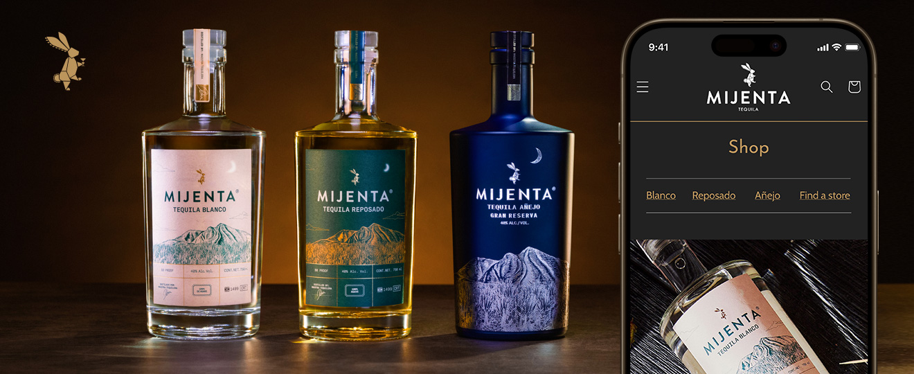
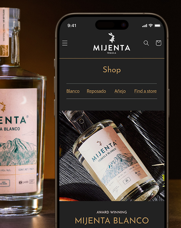
Please notice
In respect to the NDA signed with the client, some visual features shown in this page differ from the final product. This does not affect however the substance of this presentation.
Overview
Few things reduce sales like a sluggish product website made only for cosmetic purposes. This is even worse when what is for sale is a luxury, artisanal tequila crafted for demanding, high-ticket customers and renowned conoisseurs. Altos Planos had had enough of their old WordPress site: outdated and expensive plug-ins were kept just for visual's sake. Payment method integration was absent, and frustrated users had to be redirected to a dedicated but visually unrelated shop site. Many things were playing against the online customer experience of Mijenta Tequila, the company's flagship.
Why they called me
Altos Planos needed an UX/UI Designer with graphic design knowledge to act on three fronts at the same time:
- Translate their design standards from print to digital media: they didn't have any design documentation besides what they had already been using for print (bottle labels, product boxes, promotional printed media etc.);
- Fully customize the design of a Shopify theme: their outdated WordPress website would soon be taken down in order to build a brand new Shopify experience;
- Design the user buying experience from the homepage to the cart screen and check drop rates: this also included running a few A/B tests in order to verify the Shopify homepage performance on product discoverability.
How I helped them
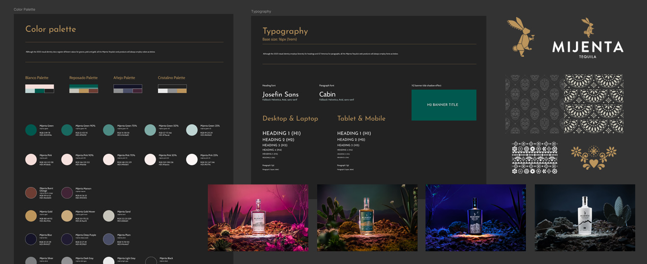
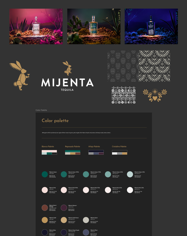
Handling many responsibilities simultaneously is not possible without planning. I used Asana for task breakdown and synchronization with my friend Emilio Malaman, the engineer in charge, and a personal Kanban to keep track of priorities. The very first thing I did was create in Figma a library with a standard color palette and typography settings to set up the basis of everything.
Design front
In Figma, I carefully matched the CMYK colors to RGB and HEX for each tequila type and, alongside typography specifications, established a standard library for all future digital products. Using Illustrator, I vectorized into AI and SVG format the original logo and decors, previously available only as bitmaps. The photos were processed in Photoshop from RAW and very high resolution JPG files to reach a balance between quality and size. I integrated all these elements into a harmonious design that respected the whole visual identity while marking a clear departure from the previous WordPress site.
Theme customization front
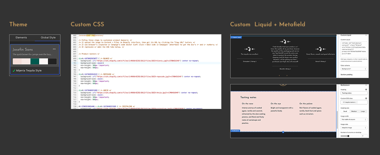
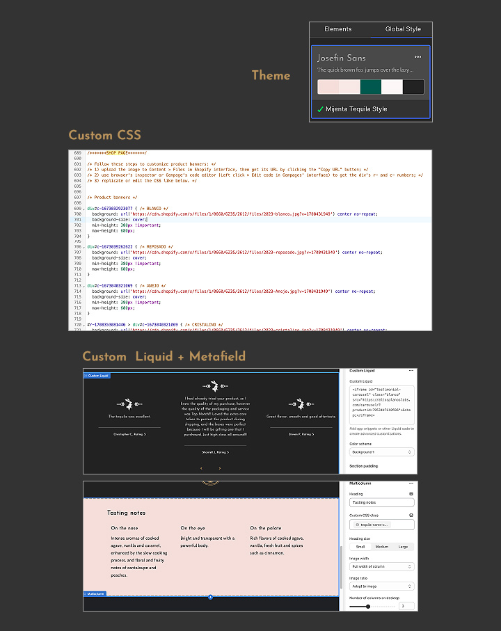
This action involved four dimensions: CSS and theme.liquid customization, the GemPages plug-in and Shopify Metafields. GemPages was used to set up theme colors, typography and the responsive layout of the site. The header, the footer and some decors and backgrounds had to be created through CSS, and special customizations like ingredients in the Product Description Page (PDP) and News Page's structure had to be inserted through Liquid editions, with help from Emilio. Metafields were needed to apply conditional CSSs to PDPs and to display sections like tasting notes and shipping details.
UX and test front
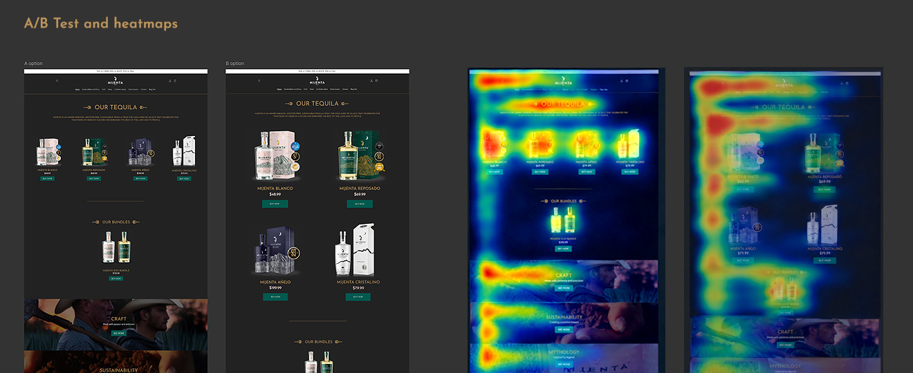
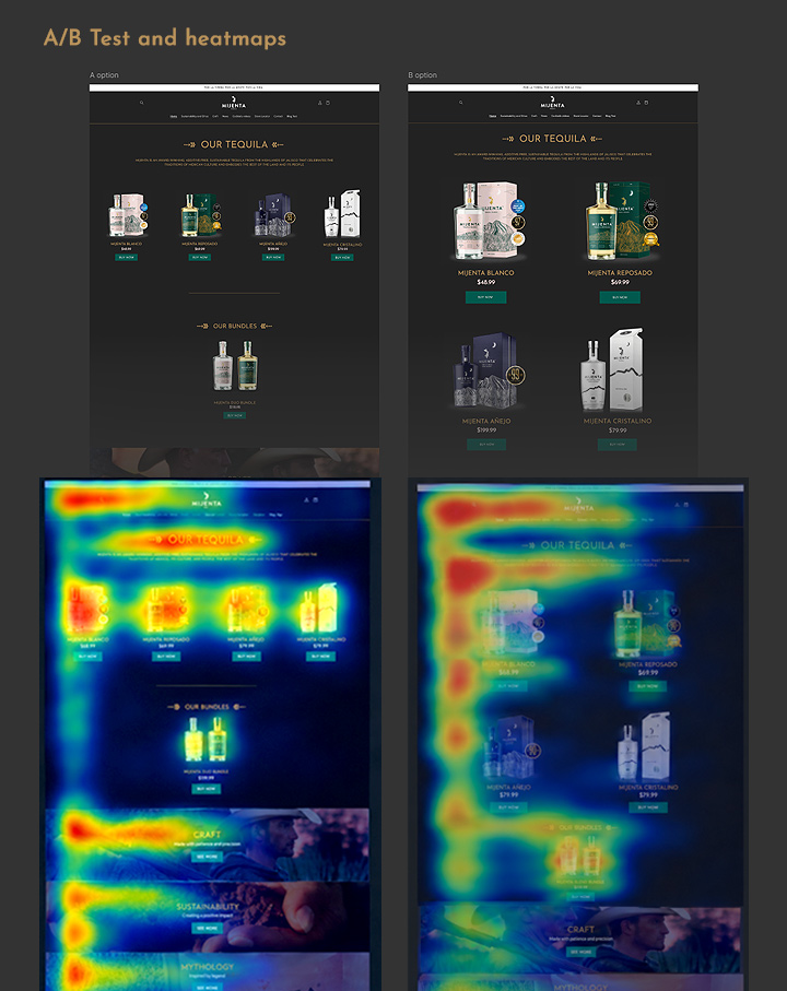
I changed the old broken user journey homepage > first PDP > redirect to an external store > second PDP > cart > payment to the much simpler homepage > PDP > cart > payment. This change alone reduced the friction that made Mijenta Tequila online sales drop. I used Matomo to run two A/B tests: one for product placement on the homepage and other for different PDP formats (one emphasizing product details and other featuring more pictures). I also built a Figma prototype to check the look and feel of the responsive layout.
Results I achieved
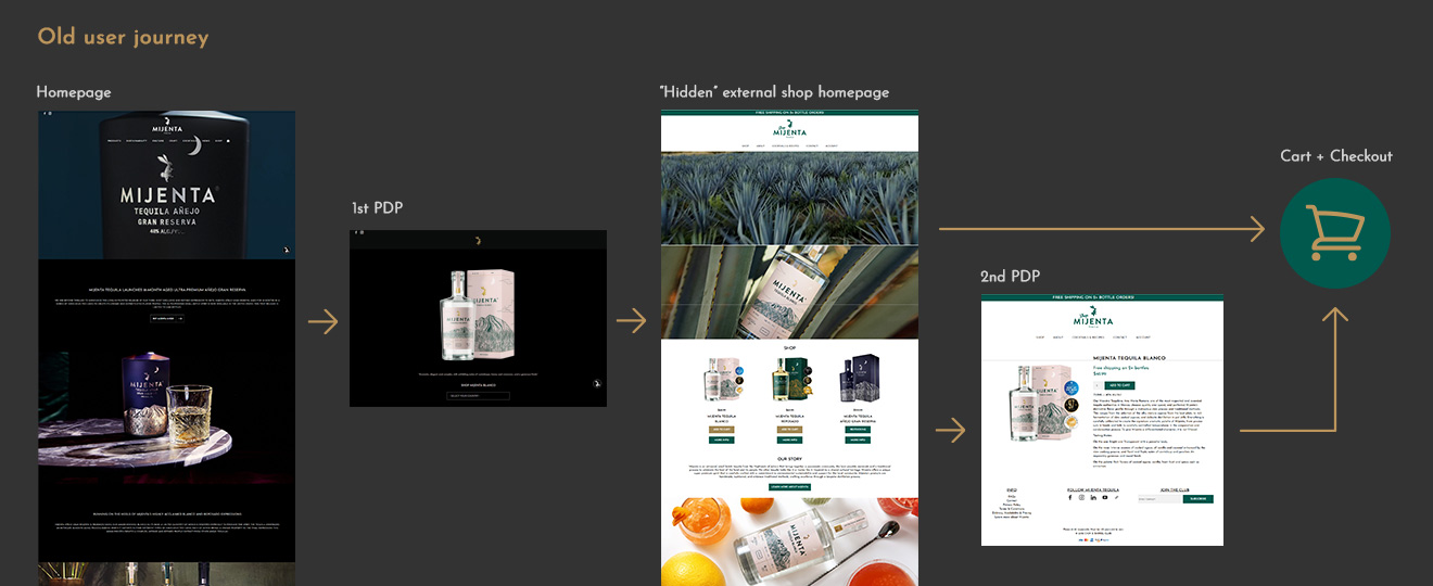
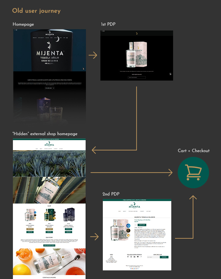
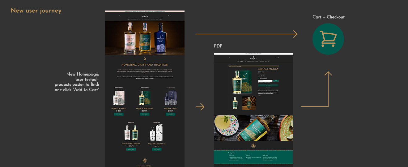
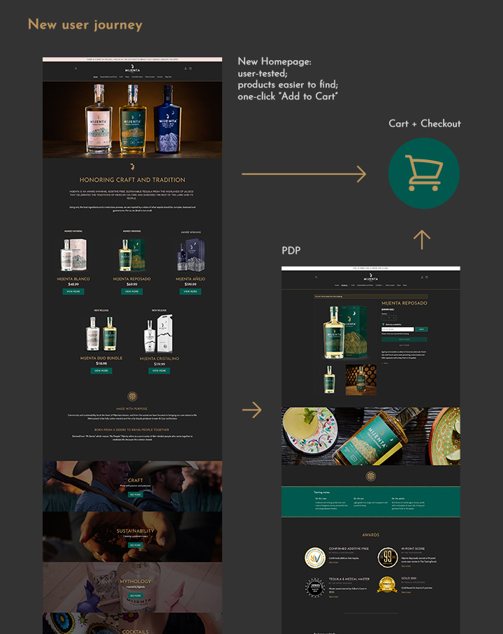
The PDP and cart drop rates were significantly reduced thanks to the user journey improvement. Matomo's findings after A/B tests helped me to identify user's preferences to adjust layouts and product placement for better performance. In the meetings after deployment, our focal point in Altos Planos was positive: although, for strategic reasons, final numbers were not disclosed, they affirmed that tequila sales did improve through the Shopify channel, more than compensating their initial investment. The Figma library I created became a reference documentation for their Marketing team, so they could rely on a single source of truth to use colors and typography for social media campaigns and ads.
Afterthoughts
There are situations in which the user experience is so below standards that just migrating from a clumsy journey to a smooth one, without thinking too much about sales strategy, is a huge improvement in itself. There is no point forcing the customers onto an external shop page that looks like a third-party workaround when it is possible to have everything integrated into a single solution with solid design and cohesive experience. Altos Planos matured its online presence and confidence gracefully like they do with their tequilas, and helping them to do it was a great milestone in my career.
The deep cultural roots in Jalisco, Mexico, lend Mijenta Tequila a powerful visual identity. Each tequila variant has its unique artisanal production process, giving them personalities represented by specific colors. The photos and videos artistically capture the craftsmanship from agave harvesting to cocktail preparation. The rabbit in the logo alludes to the myth of Centzon Totochtin. Understanding and respecting these traditions allowed me to translate their atmosphere to an efficient design with good user experience. This was quite a privilege.