Itaucard® and Credicard®
Client: Itaú Bank (Brazil)
2020-2021
UI/UX Design [User Interview, A/B tests] | Design System | HTML5 | CSS3 [Sass] | Figma + Sketch [Design + Prototype]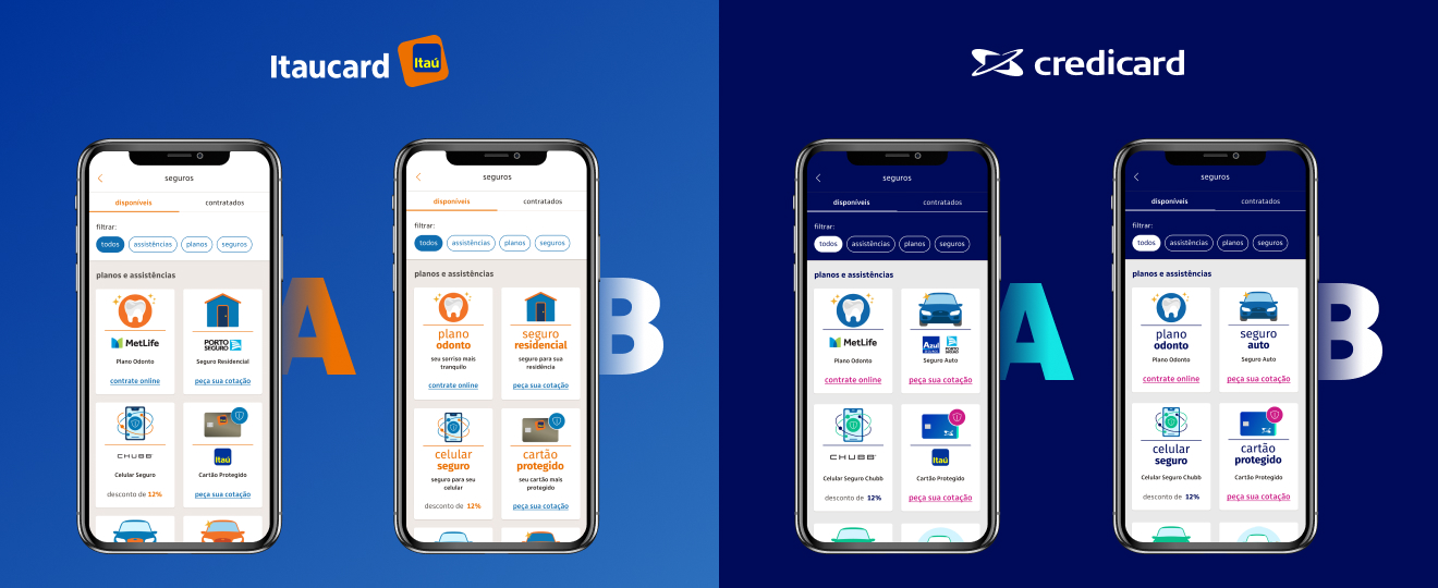
Please notice
In respect to the NDA signed with the client, some visual features shown in this page differ from the final product. This does not affect however the substance of this presentation.
Overview
June, 2020. The COVID-19 pandemic was raging on. On a cloudy Wednesday in São Paulo, at the headquarters of the largest private bank in Latin America, the sales team informed my UX squad that the number of subscriptions to benefits associated with the Itaucard® and Credicard® cards (dental plans, insurances and assistance services offered by third-party companies) had suffered an abrupt decline. Initial investigations suggested that, in that moment of great uncertainty, customers hesitated to trust the availability of these products and requested cancellation through the bank's app. What could we do to regain customer confidence ASAP and make it clear to them that Itaú Bank and its partners would guarantee the availability and quality of those benefits?
Why they called me
Itaú needed an UX/UI Designer who could conduct user interviews and build prototypes in Figma to run an A/B test on the card's benefits screen, seeking to confirm or refute the following hypotheses:
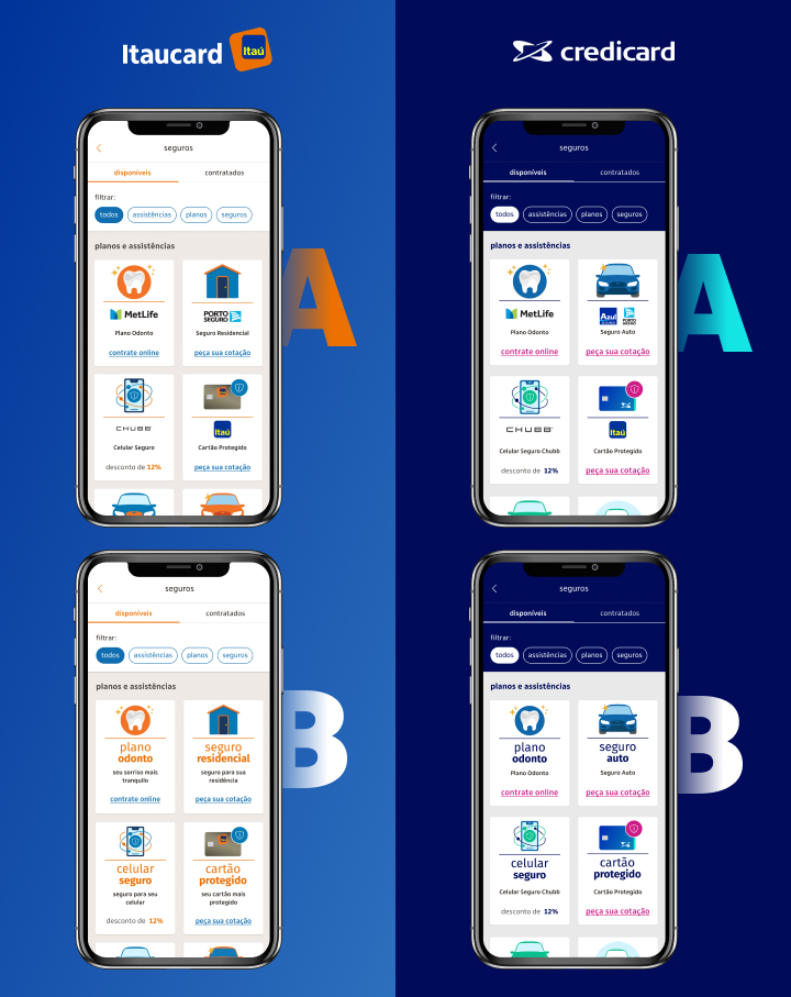
- First: brands were important for conveying trust in order to recover subscriptions. We assumed that the absence of the partner companies' logo in the UI cards of the benbefits they offered was leading people to believe that the products were merely generic, offered without any guarantee;
- Second: the user flow presented problems. We suspected that something in the screens was causing excessive friction, like the quantity of steps and form fields users had to go through and fill before subscribing.
The tests were executed with support of Itaú Lab — the internal research team, specialized in customer feedback. Every user was rewarded with a gift card for their time.
How I helped them
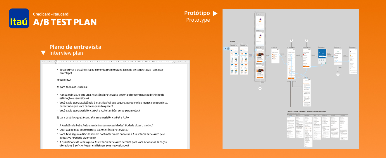
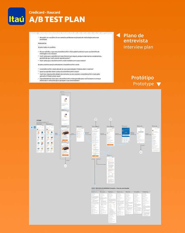
First, I wrote a interview plan and then made four Figma prototypes (one A/B pair for Itaucard® and another for Credicard®). In the option A, I mirrored the actual app experience in production with an alteration: the name of the benefits were more conspicuous on the UI cards, but no logos were placed. In the option B, I put the company logos in the UI cards. For the test, Itaú Lab selected 12 voluntaries between our clients. One half had at least one benefit subscription in the previous year, while the other half had none.
Testing the first hypothesis
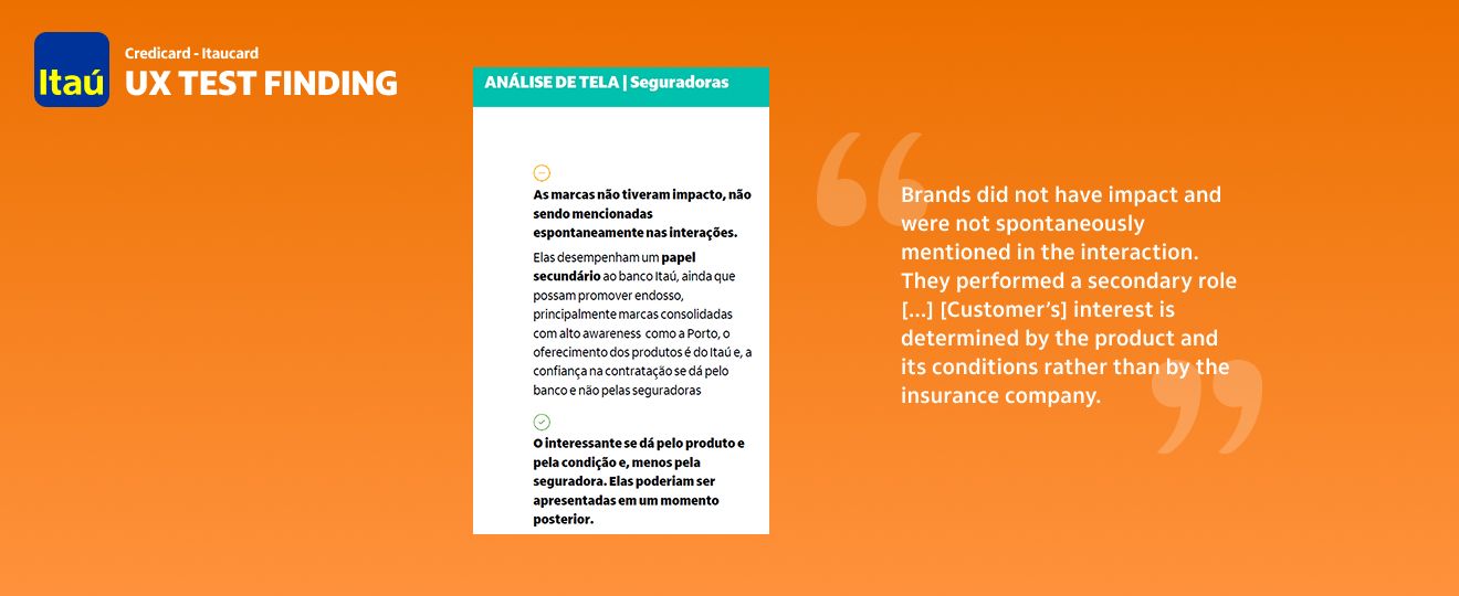
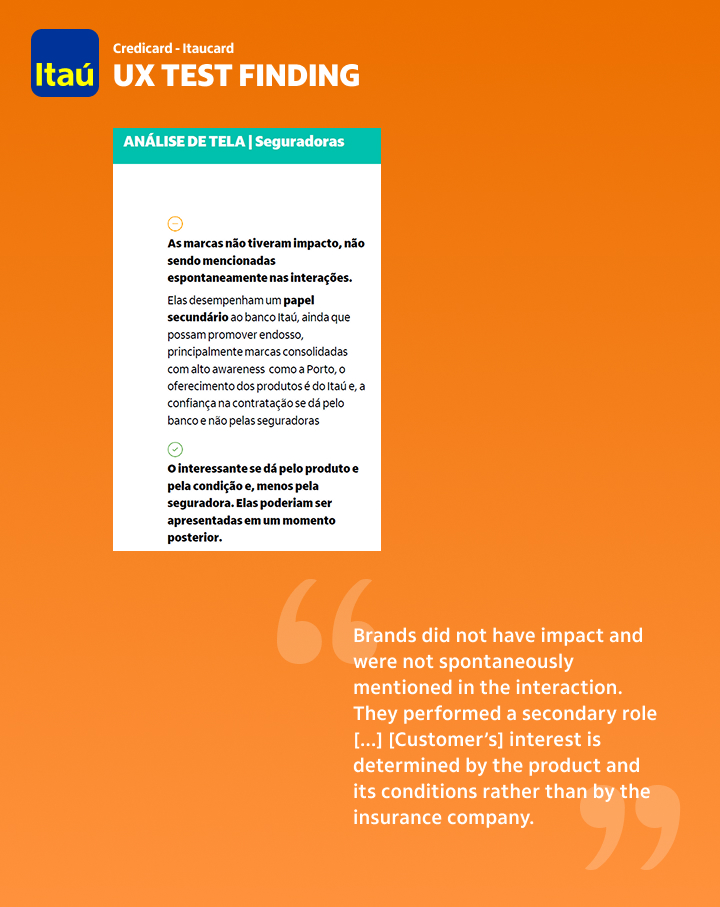
Users who already had subscriptions were asked how the benefits improved their lives, while the users who had not were asked what a benefit should offer for them to subscribe to one. Both kinds were informed about the general advantages of the benefits, randomly mixed in two groups and then submitted to the A/B prototypes with the goal of subscribing to any benefit of their preference. The test demonstrated that users wanted the benefits to have rules, coverage and advantages presented as clearly as possible, and did not pay any special attention to brands, thus refuting our hypothesis.
Testing the second hypothesis
During the A/B prototype test, I also observed users while they navigated through the screens, in order to identify potential obstacles. None of them had any trouble going from home to subscription confirmation screen. Few (n = 3) users interrupted their action to ask questions about benefit availability (a good hint to improve writing), but had no trouble at all going to the end of the journey, refuting our friction hypothesis.
Results I achieved
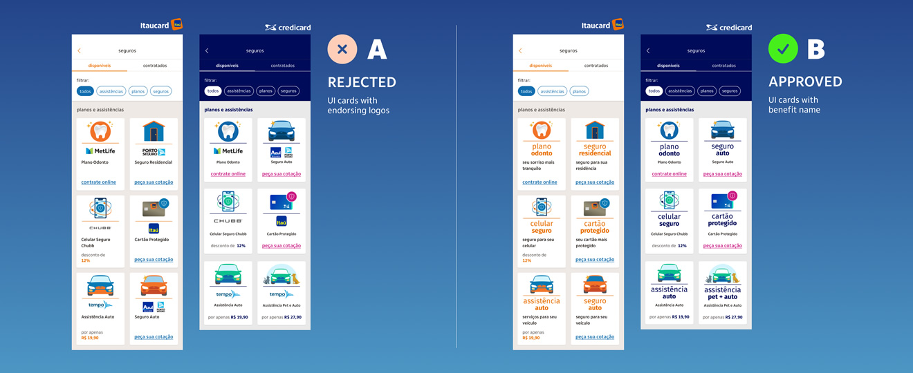
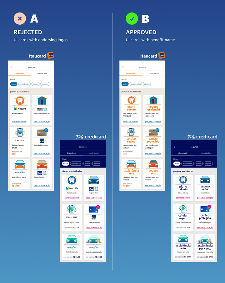
I and Itaú Lab made a quick presentation to the business stakeholders, gathering data of our tests proving that we should emphasise benefit advantages, not brand logos, in the card's benefits screen, and that the UX flow was working and needed just a few writing improvements. The design adjustment was handed off to the engineering team in less than 2 hours, and the marketing team adjusted the advertisement strategy to adopt a warm, confident and supportive tone. In 30 days, subscription rates not only were back in their tracks but performed 0.5% better.
Afterthoughts
In a market economy, even a company that has huge structure, assertive marketing campaigns and billions in assets still needs to listen to its customers in order to keep relevance and gains. Of course, it is not easy to keep calm and make rational decisions when facing unexpected challenges in hard times. And, in the UX domain, there is no better way to decide than understanding pain points. The highly professional environment I found at Itaú Bank knew this truth very well and moved based on it. I could not ask for a better workplace in a such difficult period of our recent history.
Other projects in Itaú Bank
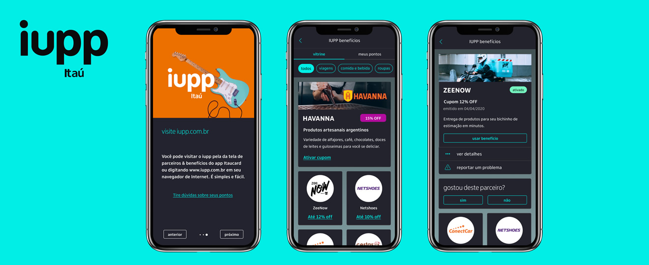
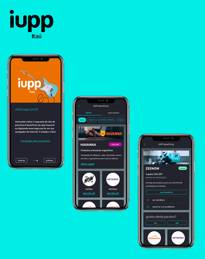
Besides Itaucard®, Credicard® and other smaller projects, I also designed the UX of IUPP app, the Itaú Bank's credit card reward program launched in January 2021. It was built using Figma and Sketch over a derivation of the company's Design System, with a different color palette.